Uncommon Ground

Monthly Archive: August 2016

Inference from noisy data with small samples

From a blog post Andrew Gelman made over a decade ago that I first came across about five or six years ago (http://andrewgelman.com/2004/12/29/type_1_type_2_t/):

In statistics, we learn about Type 1 and Type 2 errors. For example, from an intro stat book:

  • A Type 1 error is committed if we reject the null hypothesis when it is true.
  • A Type 2 error is committed if we accept the null hypothesis when it is false.

That’s a standard definition that anyone who’s had a basic statistics course has probably heard (even if they’ve forgotten it by now). Gelman points out, however, that it is arguably more useful to think about two different kinds of error,

  • Type S errors occur when you claim that an effect is positive even though it’s actually negative.
  • Type M errors occur when you claim that an effect is large when it’s really small (or vice versa).

You’re probably thinking to yourself, “Why should I care about Type S or Type M errors? Surely if I do a typical null hypothesis test and reject the null hypothesis, I won’t make a Type S error, right?”1 Wrong! More precisely, you’re wrong if your sample size is small, and your data are noisy.

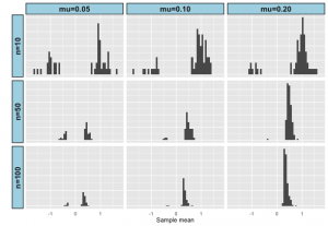
Let me illustrate this with a really simple example. Suppose we’re comparing the mean of two different populations x and y. To make that comparison, we take a sample of size N from each population, and perform a t-test (assuming equal variances in x and y). To make this concrete let’s assume that the variance is 1 in both populations and that the mean in population y is 0.05 greater than the mean in population x and suppose that N = 10. Now you’re probably thinking that the chances of detecting a difference between x and y isn’t great, and you’d be right. In fact, in the simulation below only 50 out of 1000 had a P-value < 0.05. What may surprise you is that of those 50 samples with P < 0.05, the mean of the sample from x was smaller than the mean of the sample from y. In other words, more than 30% of the time we would have made the wrong conclusion about which population had the larger mean, even though the difference in our sample was statistically significant. With a sample size of 100, we don’t pick up a significant difference between x and y that much more often (66 out of 1000 instead of 50 out of 1000), but only 9 of the 66 samples has the wrong sign. Obviously, if the difference in means is greater, sample size is less of an issue, but the bottom line is this:

If you are studying effects where between group differences are small relative to within group variation, you need a large sample to be confident in the sign of any effect you detect, even if the effect is statistically significant.

The figure below illustrates results for 1000 replicates drawn from two different populations with the specified difference in means and sample sizes. Source code (in R) to replicate the results and explore different combinations of sample size and mean difference is available in Github: https://github.com/kholsinger/noisy-data.
P-values

Gelman and Carlin (Perspectives on Psychological Science 9:641; 2014 http://dx.doi.org/10.1177/1745691614551642) provide a lot more detail and useful advice, including this telling paragraph from the conclusions:

[W]e believe that too many small studies are done and preferentially published when “significant.” There is a common misconception that if you happen to obtain statistical significance with low power, then you have achieved a particularly impressive feat, obtaining scientific success under difficult conditions.

Bottom line: Be wary of results from studies with small sample sizes, even if the effects are statistically significant.


1I’m not going to talk about Type M errors, because in my work I’m usually happy just determining whether or not a given effect is positive and less worried about whether it’s big or small. If you’re worried about Type M errors, read the paper by Gelman and Tuerlinckx (PDF).

Letters from graduate school

I recently learned of a new website that is worth putting in your bookmark list or adding to the subscription list of your RSS reader: Letters from graduate school. Here’s what they say about themselves.

For every graduate student, graduate school is a different experience filled with ups, downs, failures, and successes. The goal of Letters from Graduate School is to build a collective of graduate school experiences—your experience, in your own voice! (http://lettersfromgradschool.org)

There are four essays in Issue 1 (August 2016)

  • Love and abuse in graduate school, by an anonymous contributor, which makes a plea for teaching graduate students “that their love for research doesn’t have to be siphoned out of a finite pool of respect they’re allowed to show towards themselves.”
  • Writing on an island, by Becky Vartabedian, which describes a physical practice that helped her find her way out of the isolation that is an inevitable part of doctoral study.
  • Post-PhD: the jobs didn’t get and the one that I did, by A. Seun Ajiboye, which talks about how he found what profession he wanted in (and how he got there) after realizing that he didn’t want to be in academia.
  • Don’t check your optimism at the door, by Renee Geck, which provides some excellent advice – “Grad school doesn’t have to be a year of ignorant bliss and then a dreary trudge to the end. If you find people whom you trust to help you through the worst patches, chances are you’ll come out the other side a lot better than the people who go it alone.”

If Issue 1 is any indication, Letters from Graduate School will be a valuable resource for graduate students and graduate advisors. I look forward to reading the essays in future issues.

Beloit mindset list 2020

Every year Beloit College releases its Mindset List. Although the list has its critics (http://www.beloitmindlessness.com/must-be-destroyed/) and it’s been parodied by The Onion, I always get a kick out of looking it over. It reminds me just how old I am. Here are a few gems from this year’s list:

  • There has always been a digital swap meet called eBay.
  • There have always been Cadillac Escalades.
  • West Nile has always been a virus found in the US.
  • They have never had to watch or listen to programs at a scheduled time.
  • Vaccines have always erroneously been linked to autism.
  • They have no memory of Bob Dole promoting Viagra.
  • John Elway and Wayne Gretzky have always been retired.

National Park Service – Happy 100th birthday

100 years ago today the National Park Service was born. National parks are, as the Ken Burns documentary put it, America’s Best Idea. Unfortunately, I will not be able to participate in any of the celebrations today, nor am I likely to make it to a National Park this year, but I am delighted to live in a country that has placed such value on wild and beautiful places. I practically grew up in Yellowstone, and I’ve visited many other National Parks. Please take some time today to celebrate our good fortune, and if you’re close enough to a National Park or National Monument to visit, please consider taking the time to stop by and thank the Park Service employees for their service to our country.

What counts? Evaluating public communication in tenure and promotion

Last Friday, the American Sociological Association released a subcommittee report entitled What counts? Evaluating public communication in tenure and promotion. It suggests that public communication of research can be assessed along three axes:

  • Type of content: explanatory journalism, opinion, application of research to a practical issue
  • Rigor and quality of the communication: peer-reviewed, edited, non-edited, effectiveness of communication for the intended audience
  • Public impact: number of readers, breadth of influence on policy or practice

Amy Schalet, Director of the Public Engagement Project at UMass Amherst, argues that public communication should be included in faculty evaluations, because when we include it, “we encourage [faculty] to share their knowledge with the members of society who could most benefit from it.”

I agree, but as always, the devil is in the details. Among the questions I wrestle with are:

  • To what extent is public communication of scholarly work an aspect of scholarly achievement?
  • Should public communication be regarded primarily as service in the tenure triad of teaching, research, and service?
  • Is public communication worthwhile only if it leads to changes in public policy or professional practice? Is it worthwhile if it leads “only” to greater aesthetic appreciation of the human or natural world?

The University of Connecticut has been recognized as a “Community Engaged” campus by the Carnegie Foundation for the Advancement of Teaching since 2010 (ref). These are clearly among the questions that we need to answer.

Don’t overinterpret STRUCTURE plots

Screen Shot 2016-08-21 at 4.11.10 PM
Several weeks ago1 Daniel Falush (@DanielFalush) posted a preprint on bioRxiv, “A tutorial on how (not) to over-interpret STRUCTURE/ADMIXTURE bar plots”. I finally had a chance to read it this weekend. Here’s the abstract:

Genetic clustering algorithms, implemented in popular programs such as STRUCTURE and ADMIXTURE, have been used extensively in the characterisation of individuals and populations based on genetic data. A successful example is reconstruction of the genetic history of African Americans who are a product of recent admixture between highly differentiated populations. Histories can also be reconstructed using the same procedure for groups which do not have admixture in their recent history, where recent genetic drift is strong or that deviate in other ways from the underlying inference model. Unfortunately, such histories can be misleading. We have implemented an approach (available at www.paintmychromsomes.com) to assessing the goodness of fit of the model using the ancestry ‘palettes’ estimated by CHROMOPAINTER and apply it to both simulated and real examples. Combining these complementary analyses with additional methods that are designed to test specific hypothesis allows a richer and more robust analysis of recent demographic history based on genetic data.

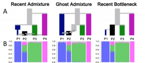
A key observation Falush and his co-authors make is that different demographic scenarios can lead to the same STRUCTURE diagram. They illustrate three different scenarios. In all of them, they simulate data from 12 populations but sample from only four of them. In all of the scenarios, population P4 has been isolated from the other three populations in the sample for a long time. It’s the relationship between P1, P2, and P3 that differs among the scenarios.

  • Recent admixture: P1 and P3 have also been distinct for some time, and P2 is a recent admixture of P1, P3, and P4.
  • Ghost admixture: P1 and P3 diverged some time ago, and P2 is a recent admixture of P1 and a “ghost” population more closely related to P3 than to P1.
  • Recent bottleneck: P1 is sister to P2 but underwent a strong recent bottleneck.

Screen Shot 2016-08-21 at 4.19.59 PM

As you can see, the STRUCTURE diagrams estimated from data simulated in each scenario are indistinguishable. They also show that if you have additional data available, specifically if you are lucky enough to be working in an organism with a lot of SNPs that are mapped, then you can combine estimates from CHROMOPAINTER with those from STRUCTURE to distinguish the recent admixture scenario from the other two – assuming that you’ve picked a reasonable number for K, the number of subpopulations.2

The authors also refer to Puechmaille’s recent work demonstrating that estimates of genetic structure are greatly affected by sample size. Bottom line: Read both this paper and Puechmaille’s if you use STRUCTURE, tread cautiously when interpreting results, and don’t expend too much effort trying to estimate the “right” K.


1OK, as you can see from the tweet, it was almost a month ago.

2The paper contains a brief remark about how hard it is to estimate K: “Unless the demographic history of the sample is particularly simple, the value of K inferred according to any statistically sensible criterion is likely to be smaller than the number of distinct drift events that have significantly impacted the sample. What the algorithm often does is in practice use variation in admixture proportions between individuals to approximately mimic the effect of more than K distinct drift events without estimating ancestral populations corresponding to each one.”

Falush, D., L. van Dorp, D. Lawson. 2016. A tutorial on how (not) to over-interpret STRUCTURE/ADMIXTURE bar plots. bioRxiv doi: 10.1101/066431
Lawson, D.J., G. Hellenthal, S. Myers, and D. Falush. 2012. Inference of population structure using dense haplotype data. PLoS Genetics 8:e1002453. doi: 10.1371/journal.pgen.1002453
Puechmaille, S.J. 2016. The program structure does not reliably recover the correct population structure when sampling is uneven: subsampling and new estimators alleviate the problem. Molecular Ecology Resources 16:608-627. doi: 10.1111/1755-0998.12512

Good news for Channel Island foxes

Channel Island foxes

National Park Service photo via Wikimedia (https://commons.wikimedia.org/wiki/File:Urocyon_littoralis_pair.jpg)

San Miguel Island, Santa Rosa Island, Santa Cruz Island, and Santa Catalina Island are each home to a subspecies of Urocyon littoralis, a small fox about the size of a house cat. The species was included as one of a number of species for which endangered species listing was “possibly appropriate” in 1982 (http://ecos.fws.gov/docs/federal_register/fr650.pdf). By 2000, there were only 15 individuals on San Miguel, 15 on Santa Rosa, and 55 on Santa Cruz, and the four subspecies were listed as endangered on March 5, 2004.

On September 12, only a little more than 12 years after they were listed, the fox subspecies on San Miguel, Santa Rosa, and Santa Cruz will be removed from the endangered species list and the subspecies on Santa Catalina will be reclassified as threatened (https://www.gpo.gov/fdsys/pkg/FR-2016-08-12/pdf/2016-18778.pdf). There are now between 700 and 2100 individuals on the islands where subspecies are being removed from the list.

Foxes on Santa Catalina Island — a tourist destination — also are recovering but not as fast as their counterparts on the northern Channel Islands. Their numbers plummeted in the 1990s after an outbreak of canine distemper, presumably brought over from the mainland.

Federal officials downgraded the status of the Catalina foxes from endangered to threatened because disease outbreak remains a concern. (http://www.latimes.com/local/lanow/la-me-ln-channel-island-foxes-20160811-snap-story.html)

It’s not often we have good news about endangered species. My thanks and congratulations go out to everyone involved in bringing these animals back from the brink of extinction.

USGS topographic maps from National Geographic

Coventry, CT - USGS 7.5 minute quad National Geographic has made available nearly all of the topographic quadrangle maps from the US Geological Survey as PDF download.

They are pre-packaged using the standard 7.5 minute, 1:24,000 base but with some twists:

  • Page 1 is an overview map showing the Quad in context
  • Pages 2 through 5 are the standard USGS Quads cut in quarters to fit on standard printers
  • Hillshading has been added to each page of the PDF to help visualize the topography

I use regularly use a GPS when I’m in unfamiliar territory, but it is even better to have a topographic map to refer to. I’m delighted to have found this resource.

Printable USGS PDF Quads from National Geographic

Climate change neoskepticism

Paul Stern and colleagues1 use the term “neoskepticism” to describe the view that although climate change is real and although humans are responsible for much of it, the costs of attempting to reduce or mitigate it exceed the benefits.

[N]eoskepticism accepts the existence of [anthropogenic climate change] but advocates against urgent mitigation efforts on various grounds, such as that climate models run “too hot” or are too uncertain to justify anything other than “no-regrets” policies as having net benefits. Mainstream climate scientists are well aware of uncertainty in climate projections. But neoskeptics’ citing of it to justify policy inaction marks a shift of focus in climate debates from the existence of ACC to its import and to response options.

The problem, of course, is that uncertainty is a double-edged sword. It’s possible that the impacts of climate change won’t be as bad as current (mean) projections, but it’s also possible that they will be far worse. Worse yet, the longer we wait to mitigate impacts, the more difficult and expensive it will be to prevent them. In response, they argue both for more attention to decision sciences and to the science of science communication. Both are certainly needed. But they also focus only on part of the science communication that’s needed, the part having to do with facts about costs, benefits, and risks of action or inaction.

As scientists, we pay too little attention to the emotional aspects of persuasion involved in guiding public policy, and here I’m not talking about appeals to “your children and grandchildren” or “our fellow creatures.” I’m talking about the emotions people feel when they think about scientists in particular or experts more generally, for example. Science communication is important even when it isn’t imparting facts or knowledge. In fact, it may be even more important when it’s not imparting facts or knowledge. It may be most important when it’s sharing scientists as caring human beings who can be trusted. Only if we are trusted will anyone listen when we share our insights with them.


1Stern, P.C., J.H. Perkins, R.E. Sparks, and R.A. Knox. 2016. The challenge of climate-change neoskepticism. Science 353:653-654. doi: 10.1126/science.aaf9697

Kudos – Help promoting papers to new audiences

I was catching up on my reading last weekend when I ran across an article in Nature describing Kudos, a site that promises “broaden readership and increase the impact of your research” (https://www.growkudos.com/about/researchers). Here’s a bit more about what they say about themselves:

Kudos is more than a just a networking site, and more than just a publication listing. It is a toolkit for explaining your work in plain language and for enriching it with links to related materials (watch a video about explaining and enriching). Kudos also provides a unique one-stop shop for multiple metrics relating to your publications: page views, citations, full text downloads and altmetrics. When you explain, enrich and share your work through Kudos, we map your actions against these metrics in charts that show you which activities are most effective when it comes to increasing the reach and impact of your work (watch a video about sharing your work).

I haven’t tried it yet, but it sounds promising. According to the article in Nature

The site is free for academics because scholarly institutions, societies, publishers and other commercial clients pay for its upkeep. Kudos helps these customers to track and evaluate their researchers (or, in the case of publishers, their authors) and foster a stronger relationship with them, explains Rapple. By encouraging researchers to do outreach, the site also indirectly builds the profile of their institution or their journal, she adds. And Rapple hopes that publishers and institutions can build up valuable intelligence from the Kudos database about the effects of different kinds of outreach. The site has established partnerships with some 65 publishers so far, including well-known firms such as Wiley and Taylor & Francis.

I’m going to try register soon. I’ll keep you posted on what I find.