spargWhen I introduced the coalescent several weeks ago, I mentioned the
“Out of Africa” hypothesisthe hypothesis that anatomically modern humans
evolved in Africa and spread from there throughout the rest of the
world. Three decades of research have strengthened support for that
hypothesis, and it is now widely accepted that anatomically modern human
populations left Africa and moved into other parts of the world about
50,000 years ago . As they expanded, they interacted
with archaic human populations, e.g., Neanderthals and Denisovans. And
when human populations interact, interbreeding often occurs. The result
is that 1-3 percent of human genomes from outside of sub-Saharan Africa
show evidence of Neanderthal ancestry and that as much as 5 or 6 percent
of the human genomes from Oceania show evidence of ancestry from
Denisovans .
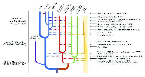
When we visualize these relationships (Figure 1), the result no
longer looks like a simple tree. There are lines connecting different
branches representing times when there was some degree of interbreeding
among populations that had previously diverged. You may have encountered
methods for inferring phylogenies in previous courses. In this course we
saw how STRUCTURE can be used to estimate
patterns of admixture. How do we go about estimating trees that are
admixed? Funny you should ask.
Pickrell and Pritchard described the most widely
used approach to estimating admixture graphs. It is implemented in
TreeMix. At about the same time Patterson et
al.
described a related method. I’m going to focus on the
TreeMix approach because I am more comfortable
with the underlying model.1 Unfortunately, if you
want to use TreeMix, you’ll have to be
comfortable with compiling C++ programs from source (or find a friend
who can help you or who can share a copy).2
The basic idea behind Treemix is not too
complicated, although it would be a stretch to say that it’s simple. We
start by assuming that the allele frequencies are changing as a result
of genetic drift. Results going back to Kimura tell us that the variance in allele
frequency is \[\mbox{Var}(p_t) =
p_o(1-p_0)\left(1 - e^{-t/2N_e}\right) \quad ,\] where \(p_t\) is the allele frequency in the
population at time \(t\), \(p_o\) is the initial allele frequency,
\(t\) is the number of generations, and
\(N_e\) is the effective population
size. So long as the effective population size is large enough that
allele frequency changes are relatively small from generation to
generation and so long as \(p_o\) is
not “too close” to 0 or 1, then we can approximate the probability
distribution of allele frequencies at time \(t\) with a normal distribution: \[\mbox{P}(p_t|p_o,t,N_e) \sim \mbox{N}\left(p_o,
p_o(1-p_o)\left(\frac{t}{2N_e}\right)\right) \quad .\] Now
suppose we have a series of four populations related like those shown in
Figure 2. As you can see, this
example shows populations that have a simple tree-like relationship.
Here’s where the fun starts.
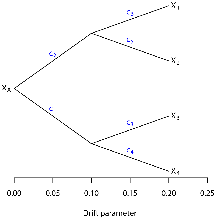
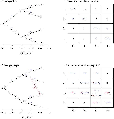
It’s a well known fact that the variance in allele frequencies (\(X_i\) in the figure) are simply \[\begin{aligned} \mbox{Var}(X_1) &=& (c_2 + c_6)X_A(1-X_A) \\ \mbox{Var}(X_2) &=& (c_2 + c_5)X_A(1-X_A) \\ \mbox{Var}(X_3) &=& (c_1 + c_3)X_A(1-X_A) \\ \mbox{Var}(X_4) &=& (c_1 + c_4)X_A(1-X_A) \quad , \end{aligned}\] where \(c_i = \frac{t_i}{2N_e^{(i)}}\), \(t_i\) is the time associated with branch \(i\) and \(N_e^{(i)}\) is the effective size of the population associated with branch \(i\). It’s obvious from looking at the tree that populations 1 and 2 have been evolving independently from populations 3 and 4 from the start, while 1 and 2 have been evolving independently of one another for a shorter period of time. As a result, we expect allele frequencies in populations 1 and 2 to be more similar than those in populations 3 and 4. In fact, Pickrell and Pritchard point out that we can write the various covariances down pretty simply too: \[\begin{aligned} \mbox{Cov}(X_1,X_2) &=& c_2X_A(1-X_A) \\ \mbox{Cov}(X_1,X_3) &=& 0 \\ \mbox{Cov}(X_1,X_4) &=& 0 \\ \mbox{Cov}(X_2,X_3) &=& 0 \\ \mbox{Cov}(X_2,X_4) &=& 0 \\ \mbox{Cov}(X_3,X_4) &=& c_1X_A(1-X_A) \quad . \end{aligned}\] As a result, we can write down a multivariate probability distribution that describes all of the allele frequencies simultaneously, given the same caveats as above about the normal distribution. \[\mbox{P}(\bf p_t|\bf p_0, \bf t, \bf N_e) \sim \mbox{MVN}(\bf p_0, \bf \Sigma) \quad ,\] where boldface refers to vectors, MVN refers to the multivariate normal distribution, and \(\bf \Sigma\) is the covariance matrix of allele frequencies. Since we can write down that probability distribution, you can probably imagine that it’s possible to estimate the likelihood of our data given a particular tree. To get a maximum likelihood estimate of how our populations are related, assuming there’s no migration, we simply have to compare the likelihoods across all possible trees and choose the one that’s most likely.3
Now suppose we allow migration from one of our populations into
another. The simple example Pickrell and Pritchard provide (Figure 3 shows a single migration from
the lineage leading to population 2 into population 3, labeling the
source population as \(Y\) and the
destination population as \(Z\). As you
can see in Panel D of the figure, the migration event changes the
structure of the covariance matrix. Since all the migration event does
is to change the covariance matrix, we can once again explore parameter
space and find the network that maximizes the likelihood. When we do so,
not only do we have estimates for population relationships and effective
population sizes but also for the timing and direction of migration
events. Estimating admixture is, however, even more challenging than
estimating a population phylogeny. The number of alternative
configurations explodes rapidly with more than 4-5 populations, making
heuristic searches necessary. Molloy et al. recently described a new approach
that builds on TreeMix and seems to avoid
getting stuck in a local optimum. Since the basic approach is the same
and this isn’t a course in computational biology, we won’t discuss it
further, but you should investigate it if you use admixture graphs in
any of your work.
As you can see, admixture graphs provide a very flexible approach to
understanding the history of populations. But they do have one
significant limitation. We have to know ahead of time which individuals
belong in which populations, just as we did with \(F\)-statistics, and just as with
STRUCTURE gave us a way to look at population
structure without pre-assigning individuals to populations, there’s a
way of looking at ancestry that uses individuals rather than pre-defined
populations . As with admixture graphs, the
mathematics lying behind the approach gets pretty hairy, but the basic
idea is pretty simple (Figure 4).
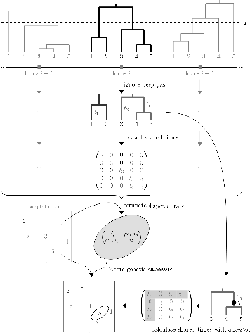
At any position along a genome, we can construct a phylogenetic tree showing the genealogical relationship among all chromosomes in the sample at that location.4
Individuals disperse randomly through space with the distance of an offspring from its mother given by a bivariate normal distribution with a mean of 0 and a covariance matrix \(\bf\Sigma\). In any real sample, glacial migrations, barriers to dispersal, or the opening of new habitat will cause some aspects of the dispersal history not to be well approximated by this model of Brownian motion, so we only use parts of the tree from the first step that are more recent than these events to estimate dispersal parameters.5
Given the estimates of time to a common ancestor between two individuals, the spatial location of those individuals, and the dispersal rate, we can estimate the spatial location of the ancestor.
This method implicitly assumes that differences are selectively
neutral.6 Although we could try this approach
with data from only one locus, the results are unlikely to be
informative for two reasons. First, there is a lot of uncertainty
associated with our estimate of phylogenetic relationships at one locus.
Second, because the coalescent history of unlinked loci will differ even
though the effective population size and the patterns of migration that
affect different loci are the same. But since the patterns of migration
are the same across different loci and since the
effective population size is the same across loci,
we can combine information across loci to get better estimates of the
dispersal rates. Since we estimate the location of ancestors at every
locus, we end up with a distribution of ancestral locations rather than
a single estimate. Osmond and Coop also point out that we can define
different “epochs” in which to estimate dispersal rates and ancestors.
This allows the dispersal rate to vary over time. All of this is
available in a Python package, sparg, which
should run on any platform with phython3 (https://github.com/mmosmond/sparg).
Plant geneticists have studied Arabidopsis
thaliana extensively. Alonso-Blanco et al. reported
results derived from sequencing 1135 different wild accessions derived
from Eurasia and North Africa. Osmond and Coop used
sparg to explore historical patterns of
dispersal and the geographical location of ancestors using this data
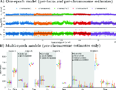
set. They first estimated dispersal rates in both a one-epoch model and
in multi-epoch models. As you can see in Figure 5, the estimates of
dispersal rates are very similar across all of the loci. In addition,
the per-generation rate of east-west dispersal (\(\sigma^2_{long}\)) is about 10 times higher
than north-south dispersal (\(\sigma^2_{lat}\)), and the correlation
between the two rates (\(\rho\)) is
relatively small. Comparison among the scenarios suggests that the
4-epoch model is the best fit to the data, suggesting that the rate of
dispersal in the last 10 generations is substantially greater than it
was earlier and that dispersal between 10 and 1000 generations ago is
greater than it was more than 1000 generations ago.
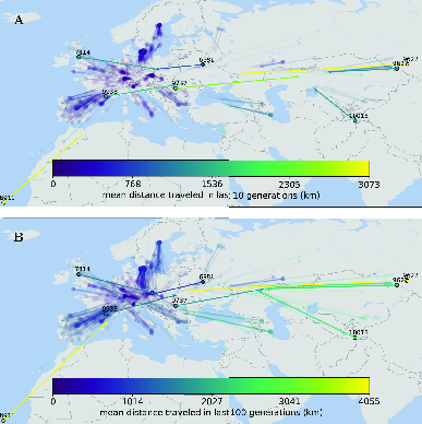
Now that we have a good idea when dispersal happened, let’s see where it happened. As you can see in Figure 6, much of the estimated dispersal over the last 10-100 generations didn’t move individuals very far. In addition, it’s a little hard to see, but if you zoom in on the figure and focus on the purple colors, you’ll notice that most of the lines leading from the dots (current locations) point towards the center of Europe. This pattern is particularly clear in for the 100-generation ago ancestral location of samples from Scandinavia. There are, however, a few individuals that moved very long distances. Individual 9627, for example, seems to have an ancestor 10 generations ago that was more than 3000km to the east of its current location, and its ancestor seems to have been more than 4000km to the east 100 generations ago.
These notes are licensed under the Creative Commons Attribution License. To view a copy of this license, visit or send a letter to Creative Commons, 559 Nathan Abbott Way, Stanford, California 94305, USA.