Let’s review the basic approach we use in genome-wide association mapping.
We measure both the phenotype, \(y_i\), of individual \(i\) and its genotype at a large number of loci, where \(x_{ij}\) is the individual’s genotype at locus \(j\).
We regress phenotype on genotype one locus at a time, using a random effect to correct for phenotypic similarities that reflect relatedness rather than similarity in genotype. \[y_i^{(k)} = x_{ij}\beta_j + \phi^{(k)} + \epsilon_i \quad .\]
Keep in mind this is a highly idealized schematic of how GWAS analyses are actually done.1 If you want to do GWAS for real, you should take a look at GEMMA (http://www.xzlab.org/software.html) or TASSEL (https://www.maizegenetics.net/tassel). One important way in which what I’ve presented is a simplification is that in a real GWAS analysis, you’d estimate the effects of every locus simultaneously, which raises an interesting problem.
In a typical GWAS analysis2, you will have measured the phenotype of a few thousand individuals, but you will have genotyped those individuals at several hundred thousand loci. Lango Allen et al. , for example, report results from a large analysis of height variation in humans, 183,727 individuals genotyped at 2,834,208 loci. What’s the problem here?
There are more predictors (loci) than observations (individual phenotypes). If you remember some basic algebra, you’ll remember that you can’t solve a set of linear equations unless you have the same number of equations as unknowns. For example, you can’t solve a set of three equations that has five unknowns. There’s a similar phenomenon in statistics when we’re fitting a linear regression. In statistics we don’t “solve” an equation. We find the best fit in a regression, and we can do so in a reasonable way so long as the number of observations exceeds the number of variables included in our regression. To put a little mathematical notation to it, if \(n\) is the number of observations and \(p\) is the number of regression parameters we hope to estimate, life is good (meaning that we can estimate the regression parameters) so long as \(n > p\).3 The typical situation we encounter in GWAS is that \(n < p\), which means we have to be really sneaky. Essentially what we do is that we find a way for the data to tell us that a lot of the parameters don’t matter and we fit a regression only to the ones that do, and we set things up so that the remaining number of parameters is less than \(n\). If that all sounds a little hoky, trust me it isn’t. There are good ways to do it and good statistical justification for doing it4, but the mathematics behind it gets pretty hairy, which is why you want to use GEMMA or TASSEL for a real GWAS. We’ll ignore this part of the challenge associated with GWAS and focus on another one: complex traits often are influenced by a very large nubmer of loci. That is, after all, why we started studying quantitative genetics in the first place.
Let’s return to that Lango Allen et al. GWAS on height in humans. They identified at least 180 loci associated with differences in height. Moreover, many of the variants are closely associated with genes that are part of previously identified pathways, e.g., Hedgehog signaling,5 or that were previously identified as being involved in skeletal growth defects. A more recent study by Wood et al. synthesized results from 79 studies involving 253,288 individuals and identified 697 variants that were clustered into 423 loci affecting differences in height.6 Think about what that means. If you know my genotype at only one of those 697 variants, you know next to nothing about how tall I am (Figure 1). But what if you knew my genotype for all of those variants? Then you should be able to do better.
The basic idea is fairly simple. When you do a full GWAS and estimate the effects at every locus simultaneously, you are essentially performing a multiple regression of phenotype on all of the loci you’ve scored simultaenously instead of looking at them one at a time. In equation-speak, \[y_i^{(k)} = \sum_j x_{ij}\beta_j + \phi^{(k)} + \epsilon_i \quad .\] Now think a bit more about what that equation means. The \(\phi^{(k)}\) and \(\epsilon_i\) terms represent random variation, in the first case variation that is correlated among individuals depending on how closely related they are and in the second case variation that is purely random. The term \(\sum_j x_{ij}\beta_j\) reflects systematic effects associated with the genotype of individual \(i\). In other words, if we know individual \(i\)’s genotype, i.e., if we know \(x_{ij}\) we can predict what phenotype it will have, namely \(\mu_i = \sum_j x_{ij}\beta_j\). Although we know there will be uncertainty associated with this prediction, \(\mu_i\) is our best guess of the phenotype for that individual, i.e., our genomic prediction or polygenic score. In the case of height in human beings, it turns out that the loci identified in Wood et al. account for about 16 percent of variation in height.7 If we don’t have too many groups, we could refine our estimate a bit further by adding in the group-specific estimate, \(\phi^{(k)}\). Of course when we do so, our prediction is no longer a genomic predictiion, per se. It’s a genomic prediction enhanced by non-genetic group information.
To make all of this more concrete, we’ll explore a toy example using
the highly simplified one locus at a time approach to GWAS with a highly
simplified example of the multiple regression approach to GWAS. You’ll
find an R notebook that implements all of
these analyses at http://darwin.eeb.uconn.edu/eeb348-notes/Exploring-genomic-prediction.nb.html.
I encourage you to download the notebook as you follow along. You will
find it especially useful if you try some different scenarios by
changing nloci and
effect when you generate the data that you
later analyze locus by locus or with genomic prediction. Here’s what the
code as written does:
Generate a random dataset with 100 individuals and 20 loci, 5 of which influence the phenotype. The simulation is structured so that allele frequencies are correlated across the loci. The effect of one “1” allele at locus 1 is 1, at locus 2 -1, at locus 3 0.5, at locus 4 -0.5, and at locus 5 0.25. The standard deviation of the phenotype around the predicted mean is 0.2.
Run the locus-by-locus regression for each locus and store the
results (mean and 95% credible interval) in
results. results is
sorted in by the magnitude of the posterior mean, so that loci with the
largest estimated effect occur at the top and loci with the smallest
effect occur at the bottom.
Run the multiple regression and store the results in
results_gp.
If you look at the code, you’ll see that I use
stan_lm() rather than using
brm. That’s because I simulate the data
without family structure, so there’s no need to include the family
random effect.
Table 1 shows results of the locus by locus analysis.
| mean | 2.5% | 97.5% | |
|---|---|---|---|
| locus_2 | -1.013 | -1.184 | -0.800 |
| locus_1 | 0.979 | 0.687 | 1.270 |
| locus_4 | -0.743 | -1.086 | -0.406 |
| locus_5 | 0.462 | 0.027 | 0.906 |
| locus_3 | 0.390 | 0.039 | 0.742 |
| locus_20 | -0.382 | -0.857 | 0.081 |
| locus_8 | 0.374 | -0.001 | 0.764 |
| locus_7 | -0.327 | -0.681 | 0.052 |
| locus_12 | 0.271 | -0.144 | 0.671 |
| locus_6 | 0.235 | -0.220 | 0.691 |
| locus_11 | 0.191 | -0.391 | 0.784 |
| locus_13 | -0.173 | -0.557 | 0.209 |
| locus_10 | -0.113 | -0.490 | 0.258 |
| locus_19 | -0.106 | -0.437 | 0.239 |
| locus_14 | -0.093 | -0.555 | 0.347 |
| locus_15 | 0.075 | -0.280 | 0.421 |
| locus_18 | -0.061 | -0.434 | 0.308 |
| locus_17 | 0.050 | -0.362 | 0.458 |
| locus_16 | -0.009 | -0.350 | 0.331 |
| locus_9 | 0.007 | -0.370 | 0.396 |
For this simulated data set the five loci with the largest estimated effect are the same five loci for which the simulation specified an effect, but notice the locus 20 and locus 8 have estimated allelic effects almost as large as the top five and that the estimate for locus 8 barely overlaps zero. Given only these results it would be reasonable to conclude that we have evidence for an effect of locus 20 and locus 8, although the evidence is weak.
What about the multiple regression approach? First, take a look at
the estimated effects (Table 2). Not
only does this approach pick out the right loci, the first five, none of
the other loci have particularly large estimated effects. The largest,
locus_17 is only about -0.08. It would take
much more extensive simulation to demonstrate the advantage empirically,
but it is clear from first principles that multiple regression analyses
will generally be more reliable than locus by locus analyses because a
multiple regression analysis takes account of random associations among
loci.
| mean | 2.5% | 97.5% | |
|---|---|---|---|
| locus_1 | 1.039 | 0.898 | 1.175 |
| locus_2 | -0.971 | -1.120 | -0.820 |
| locus_3 | 0.586 | 0.441 | 0.724 |
| locus_4 | -0.521 | -0.667 | -0.369 |
| locus_5 | 0.353 | 0.153 | 0.538 |
| locus_17 | -0.082 | -0.254 | 0.028 |
| locus_13 | 0.062 | -0.037 | 0.208 |
| locus_7 | -0.058 | -0.205 | 0.038 |
| locus_10 | 0.047 | -0.047 | 0.196 |
| locus_9 | -0.030 | -0.166 | 0.062 |
| locus_14 | 0.020 | -0.089 | 0.166 |
| locus_8 | 0.018 | -0.078 | 0.149 |
| locus_18 | 0.016 | -0.076 | 0.128 |
| locus_16 | 0.014 | -0.076 | 0.123 |
| locus_20 | 0.011 | -0.100 | 0.142 |
| locus_6 | -0.009 | -0.136 | 0.107 |
| locus_11 | -0.008 | -0.159 | 0.121 |
| locus_12 | 0.008 | -0.097 | 0.123 |
| locus_15 | 0.003 | -0.090 | 0.103 |
| locus_19 | 0.000 | -0.091 | 0.094 |
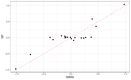
Let’s see what other differences we find when we compare the two approaches more directly. First, let’s look at the estimated allelic effects themselves (Figure 2). As you can see, they are broadly similar, but if you look closely, they are most similar when the estimated allelic effects are small.
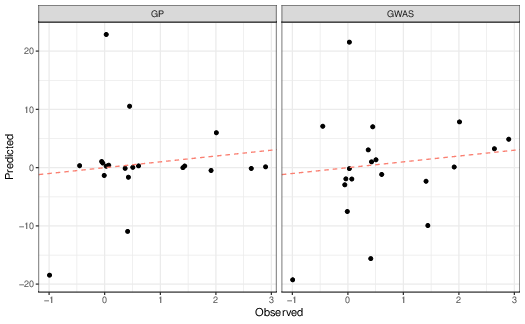
More interesting than whether the estimated allelic effects are similar is whether the predicted phenotypes are similar to the observed phenotypes (Figure reffig:gwas-obs-vs-predicted). As you can see, in this simple simulated data set both approaches work reasonably well, even though the estimated allelic effects are rather different. As expected, though, the multiple regression approach has less error than the locus-by-locus approach, an \(R^2\) of 11.1 vs. 14.2.
In the early 2010s, Turchin and colleagues 8 studied the association between variation at SNP loci and height in humans. They showed that both individual alleles known to be associated with increased height and in genome-wide analysis are elevated in northern European populations compared to populations from southern Europe. They argued that these differences were consistent with weak selection at each of the loci (\(s \approx [10^{-3}, 10^{-5}]\)) rather than genetic drift alone.
Turchin et al. used allele frequency estimates from the Myocardial Infarction Genetics consortium (MIGen) and the Population Reference Sample (POPRES) . For the MIGen analysis, they compared allele frequencies in 257 US individuals of northern European ancestry with those in 254 Spanish individuals at loci that are known to be associated with height based on GWAS analysis9 and found differences greater than those expected based on 10,000 SNPs drawn at random and matched to allele frequencies at the target loci in each population. They performed a similar analysis with the POPRES sample and found similar results.
Turchin et al. were aware that the association could be spurious if ancestry was not fully accounted for in these analyses, so they also used data collected by the Genetic Investigation of ANthropometric Traits consortium (GIANT) .10 They noted that “control” SNPs used in the preceding analysis, i.e., the 10,000 SNPs drawn at random from the genome, with a tendency to increase height in the GIANT analysis also tended to be more frequent in the northern European sample.
They compared the magnitude of the observed differences at the most strongly associated 1400 SNPs with what would be expected if they were due entirely to drift and what would be expected if they were due to a combination of drift and selection. A likelihood-ratio test of the drift alone model versus the drift-selection model provided strong support for the drift-model.
This all seems very promising, but a word of caution is in order. Berg et al. re-examined these claims using new data available from the UK Biobank (https://www.bdi.ox.ac.uk/research/uk-biobank), which includes a host of information on individual phenotypes as well as genome-wide genotypes for the 500,000 individuals included in the sample.11 They failed to detect evidence of a cline in polygenic scores in their analysis (Figure 4).
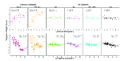
In thinking about this result, it’s important to understand that Berg et al. did something a bit different from what we did, but it’s exactly what you’d want to do if polygenic scores worked. They estimated polygenic scores from each of the data sets identified in the figure. Then they used those scores to estimate polygenic scores for a new set of samples derived from the 1000 Genomes and Human Origins projects.12 Since they did the same thing with all of the data sets, this difference from what we did doesn’t account for the differences among data sets. As Berg et al. dug more deeply into the data, they concluded that all of the data sets “primarily capture real signals of association with height” but that the GIANT and R-15 sibs data sets, the ones that show the latitudinal (and longitudinal in the case of GIANT) associations do so because the estimated allelic effects in those data sets failed to fully remove confounding variation along the major geographic axes in Europe.
The Berg et al. analysis illustrates how difficult it is to remove confounding factors from GWAS and genomic prediction analyses. Turchin et al. are highly skilled population geneticists. If they weren’t able to recognize the problem with stratification in the GIANT consortium data set, all of us should be concerned about recognizing it in our own. Indeed, I wonder whether the stratification within GIANT would ever have come to light had Berg et al. not had additional large data sets at their disposal in which they could try to replicate the results.
In one way the Berg et al. results are actually encouraging. They estimated effects in one set of data and used the genomic regressions estimated from those data to predict polygenic scores in a new data set pretty successfully. Maybe it’s difficult to be sure that the polygenic scores we estimate are useful for inferring anything about natural selection on the traits they predict, but if we could be sure that they allow us to predict phenotypes in populations we haven’t studied yet, they could still be very useful. Can we trust them that far?
Unfortunately, the answer appears to be “No.” Yair and Coop recently studied the relationship between phenotypic stabilizing selection and genetic differentiation in isolated populations. They showed that even in a very simple model in which allelic effects at each locus are the same in both populations, polygenic scores estimated from one population may not perform very well in the other. Interestingly, as you can see in Figure 5, the stronger the selection and the more strongly allelic differences influence the phenotype, the less well genomic predictions in one population work in the other.

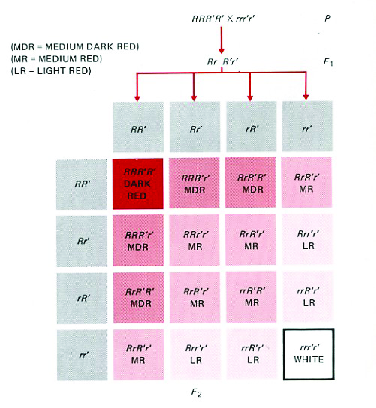
That seems paradoxical, but interestingly it’s not too difficult to understand if we think about what happens when we combine stabilizing selection with geographical isolation.13 First, let’s remind ourselves of a fundamental property of polygenic variation: Different genotypes can produce the same phenotype. Figure 6, which you’ve seen before, illustrates this when three loci influence the trait. While there is only one genotype that produces the dark red phenotype and only one that produces the white phenotype, there are four genotypes that produce the light red phenotype, four that produce the medium dark red phenotype, and six that produce the medium red phenotype. Goldstein and Holsinger called this phenomenon genetic redundancy. As you can imagine, the number of redundant genotypes increases dramatically as the number of loci involved increases.14
http://www.biology-pages.info/Q/QTL.html,
accessed 9 April 2017).Why does this redundancy matter? Let’s consider what happens when we impose stabilizing selection on a polygenic trait, where \[w(z) = \mbox{exp}\left(\frac{-(z - z_0)^2}{2V_s}\right) \quad ,\] where \(z_0\) is the intermediate phenotype favored by selection, \(z\) is the phenotype of a particular individual, and \(V_s\) is the variance of the fitness function. If selection is weak (\(V_s = 115.2\)), then the relative fitness of a genotype 1 unit away from the optimum is 0.9957 while that of a genotype 8 units away is only 0.7575. If 16 loci influence the trait, there are 601,080,390 genotypes that produce the optimum phenotype and have the same fitness. There are another 1,131,445,440 genotypes whose fitness within one percent of the optimum. Not only are there a lot of different genotypes with roughly the same fitness, the selection at any one locus is very weak.
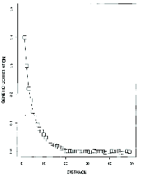
Now suppose these genotypes are distributed in a large, continuous population. Because selection is pretty weak and because mating is primarily with close neighbors, allele frequency changes at each locus will be close to what they would be if the loci were neutral. The result is that the genetic correlation between individuals drops off rapidly as a function of the distance between them (Figure 7). Notice that in the simulation illustrated individuals separated by more than about 20 distance units are effectively uncorrelated. That means that their genotypes are essentially random with respect to one another, even though their phenotypes are similar because of the stabilizing selection.
Now think about what that means for polygenic scores. Imagine that we sampled two ends of a large, continuously distributed population. To make things concrete, let’s imagine that the population is distributed primarily North-South so that our samples come from a northern population and a southern one. Now imagine that we’ve done a GWAS in the northern population and we want to use the genomic predictions from that population to predict phenotypes in the southern population. What’s going to happen?
The genotypes in the southern population will be a random sample from all of the possible genotypes that could produce the same optimal phenotype (or something close to the optimum) and that sample will be independent of the sample of genotypes represented in our northern population. As a result, there are sure to be loci that are useful for predicting phenotype in the northern population that aren’t variable in the southern population, which will reduce the accuracy of our genomic prediction. That’s precisely what Yair and Coop show.15
In short, it’s to be expected that genomic predictions will be useful only within the population for which they are constructed. They can be very useful in plant and animal breeding, for example, but any attempt to use them in other contexts must be alert to the ways in which extrapolation from one population to another will be problematic.
These notes are licensed under the Creative Commons Attribution License. To view a copy of this license, visit or send a letter to Creative Commons, 559 Nathan Abbott Way, Stanford, California 94305, USA.